How to draw Pride ( and crowds)
Hello! It’s Lea again,
I hope you had a great week. If you don’t know me, it's nice to meet you! This is Sunday Spreads, my weekly personal illustration challenge. For this week, I wanted to represent the best as I could the mood of this year’s Pride walk in Paris and by doing so, I could try my hand at illustrating a lot of characters at once! Here is the final illustration and you can read the process below.
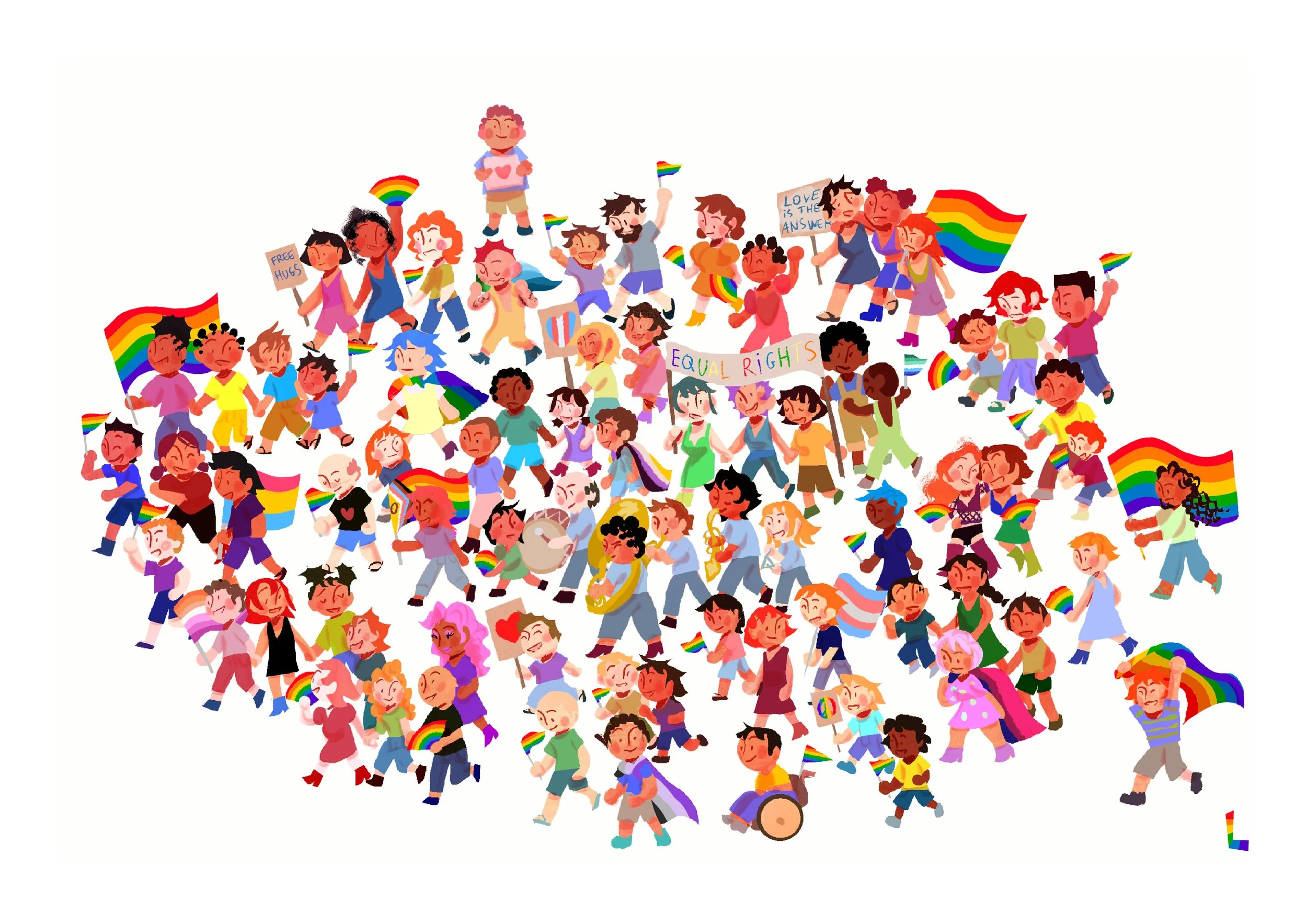
Little backstory point: I have done many pride walks when I was younger, but this one was the first I have done in a while! And what a joy it was, people of all generations and origins, coming together in the name of Love. I then noticed a LOT of new flags that I didn’t know. I guess this illustration is a way for me to learn all the flags ( might even do a little zine projects focusing on all the flags later on!)
But for now, The question is: how to capture Pride’s energy and love in a drawing? And how to draw a crowd ?

1. Keep it simple
Okay, this is really a process of small things I have learned and tried along the way! But if you want to try it yourself, you are more than welcome to try your own ! ( and to share your own tips and tricks that you have found ! )
My first step was to create a little stickman, that I could place around my page, as a template for the actual people that I would draw in later.

Here he is! Perfectly bland and vacant, but perfect to start figuring out a crowd. Now let’s make a brush out of him, and stamp him all across our page. This will help us to keep good proportion for every single person in the crowd.
( note: I used Procreate for this, but you can use any software or if you’re working traditional, maybe you can trace a stickman using transfer paper ?)
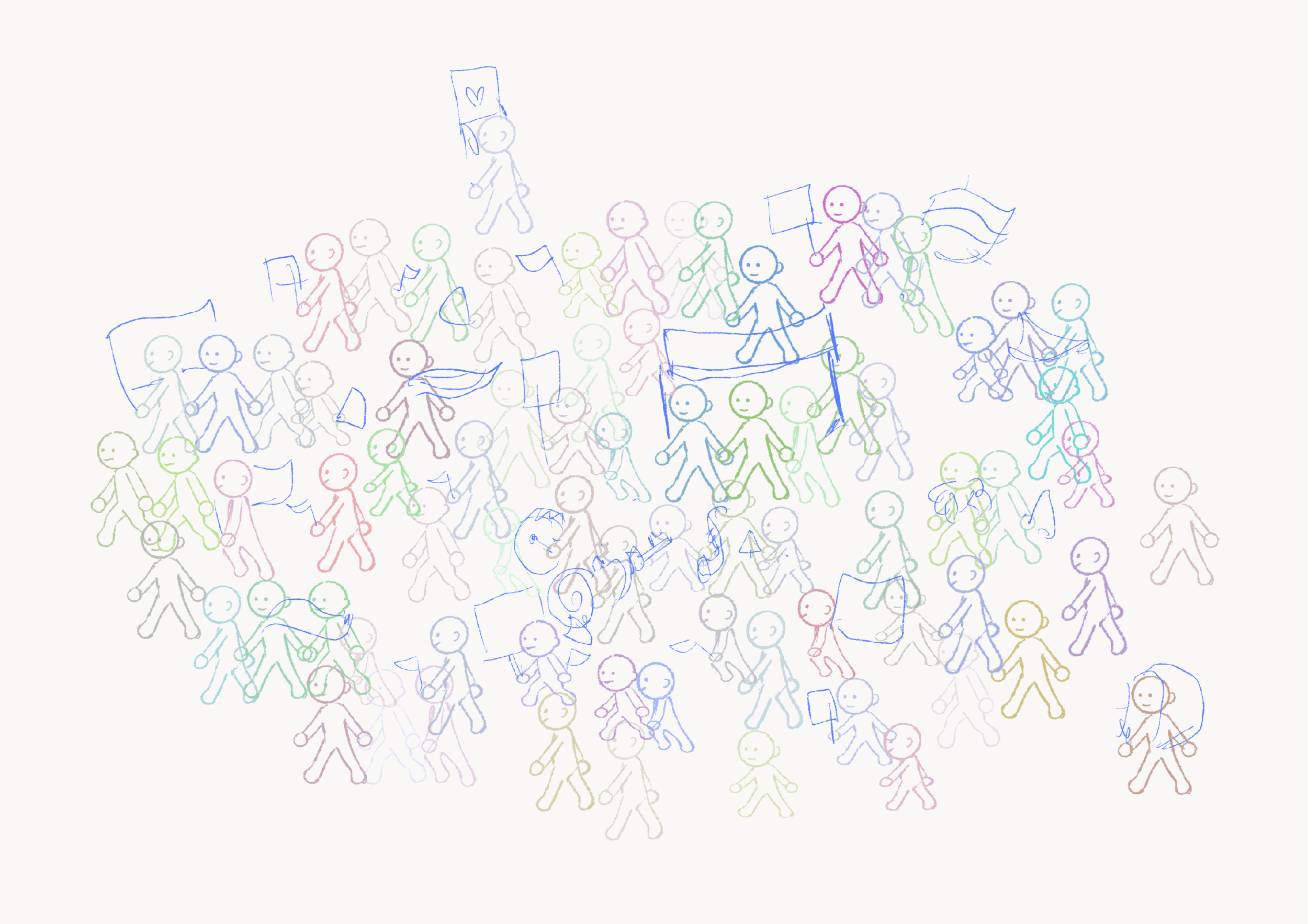
2. Have a really, really clear Rough
I stamped that little guy all over the canvas until I had a decent crowd to work with ( I also added different poses ):
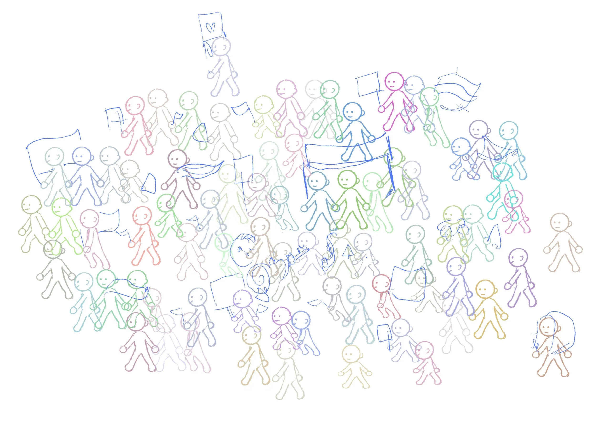
With a rough clear enough, it was time to start the actual illustration.
3. Use minimum layer
Now, as a personal preference, I rarely use Line art, just rough lines that I can paint over later. I prefer to block in the shapes of my elements, and work layer by layer, building up details. That being said, with that many characters ( I counted 75 on my page) it was important to limit myself and to work on only one layer for all the characters, and adding a layer only to add extra details. ( Like 1 layer for the body, one for all the clothes, one for the hair, one for the face, etc.. )
Here are all my main layers :
I was then able to build details using clipping masks
4. Try to not get lost in details…. but add the details you care for anyway
As I was shaping the characters, I was really torn between detailing all the characters and taking the illustration to a place where I could call it finished. After a couple of days I really needed to finish it so I did a really general pass on all the characters. But there are some special places in the piece that I am proud of, like the brass band, the girl with the huge flag, the picket signs, the flags and fans, all these details were important to me so I spent time on them.


Anyway, let me know what you think, and don’t hesitate to reach out. I am always looking to connect with fellow artists & illustrators to share the joys and sorrows of creating pretty pictures from our heads.
See you soon
Lea